
搜索类页面的封装实现, 使用 react
forceUpdateArgs
如果需要定制化筛选条件, 请设置 FromWraper props -> defaultCustomFiltersConf
支持响应式布局, 请设置 FromWraper props -> theme, 或使用 FromWraper.FormItem props -> colProps
License
search-page
搜索类页面的封装实现, 使用 react
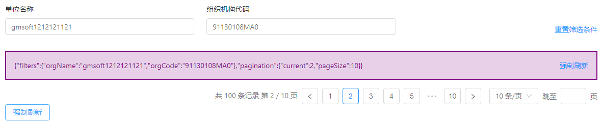
yarn add search-page Sreenshot
Demo.tsx
import React, { useRef, useCallback } from 'react'; import createSearchPage, { GetDataApi } from 'search-page'; import { Button } from 'antd'; import FiltersForm from './FiltersForm'; import Content from './Content';
const getDataApi: GetDataApi = async (filters, pagination) => { await new Promise(resolve => setTimeout(resolve, 1000)); const result = await Promise.resolve({ data: { filters, pagination }, total: 100 }); return result; };
const SearchPage = createSearchPage({ filtersDefault: { orgName: 'gmsoft' }, pageSize: 40, noPagination: false, getDataApi, FiltersForm, });
const Demo = () => { const searchPageRef = useRef({ forceUpdate: () => undefined }); const forceUpdate = useCallback(() => { searchPageRef.current.forceUpdate(); }, []); return ( <div style={{ padding: 16 }}> <SearchPage ref={searchPageRef}>{Content}</SearchPage> <Button onClick={forceUpdate}>强制刷新</Button> </div> ); };
export default Demo;
Content.tsx
import React from 'react'; import styled from 'styled-components'; import { ContentProps } from 'search-page';
const Wrap = styled.div` padding: 16px; border: 2px solid purple; background-color: #8000802e; color: purple; `;
const Content = ({ data, forceUpdate, loading, filters }: ContentProps) => ( <Wrap> data: {JSON.stringify(data)} <br /> filters: {JSON.stringify(filters)} <a style={{ float: 'right' }} onClick={forceUpdate}> 强制刷新 </a> </Wrap> ); export default Content;
FiltersForm.tsx (使用 buildFiltersForm)
/** * buildFiltersForm 目前只支持 input 类型 * 如果搜索条件复杂, 请使用FormWrapper */ import { buildFiltersForm, Fields } from 'search-page';
const fields: Fields = { orgName: { type: 'input', label: '单位名称' }, orgCode1: { type: 'input', label: '组织机构代码 1' }, orgCode2: { type: 'input', label: '组织机构代码 2' }, orgCode3: { type: 'input', label: '组织机构代码 3' }, orgCode4: { type: 'input', label: '组织机构代码 4' }, };
export default buildFiltersForm(fields, { // 可选,是否需要重置操作 needReset: true, // 精简模式配置 simpleMode: { enable: true, count: 2, // count 优先级高于 rows // row: 1 }, });
import React from 'react'; import { Form, Input, Select, Col } from 'antd'; import { FormWrapper, FiltersFormType } from 'search-page'; import { withRouter, RouteComponentProps } from 'react-router-dom'; const { Option } = Select; // 包装容器,自定义栅格的时候使用 const { FormItem } = FormWrapper; const FiltersForm: FiltersFormType<RouteComponentProps<any>> = props => { const { form: { getFieldDecorator }, } = props; return ( <FormWrapper {...props} simpleMode={{ rows: 1 }} resetRetainFiltersDefaultKeys={[]} > {/* 需要自定义栅格时请使用包装容器 */} <FormItem span={8} label="orgName"> {getFieldDecorator('orgName')(<Input placeholder="Please input your name" />)} </FormItem> {/* 可设置为响应式布局 */} <FormItem colProps={{ lg: 6, md: 8, sm: 12, xs: 24 }} label="name1"> {getFieldDecorator('name1')( <Select> <Option value="1">选项一</Option> <Option value="2">选项二</Option> </Select> )} </FormItem> {/* 与Antd原有FormItem可以混用,原Form.Item占据默认栅格大小:8 */} <Form.Item label="name2"> {getFieldDecorator('name2')( <Select> <Option value="1">选项一</Option> <Option value="2">选项二</Option> </Select> )} </Form.Item> <Form.Item label="name3"> {getFieldDecorator('name3')( <Select> <Option value="1">选项一</Option> <Option value="2">选项二</Option> </Select> )} </Form.Item> </FormWrapper> ); }; export default withRouter(FiltersForm); HandwrittenFormDemo.tsx (完全自己手写)
import React, { useCallback } from 'react'; import Form, { FormComponentProps } from 'antd/lib/form'; import { Row, Col, Input } from 'antd'; const FiltersForm = ({ form }: FormComponentProps) => { const { resetFields, getFieldDecorator } = form; const reset = useCallback(() => { resetFields(); }, [resetFields]); return ( <Form layout="vertical"> <Row gutter={24}> <Col span={8}> <Form.Item label="单位名称">{getFieldDecorator('orgName')(<Input />)}</Form.Item> </Col> <Col span={16} style={{ textAlign: 'right' }}> <Form.Item label=" "> <a className="action" onClick={reset} role="button"> 重置筛选条件 </a> </Form.Item> </Col> </Row> </Form> ); }; export default FiltersForm; 配置用户侧自定义表头列宽度(Content.tsx)
注意事项:
Table 列配置只能使用 Confs 数组配置模式,不能使用 Jsx 模式 列宽只能指定具体像素,不能使用百分比,插件实现问题 列宽数据存储行为与 Filter 条件一致 dispatch、tableWidthConfs、storeKey 均为 SearchPage 内部属性,使用时可以直接透传 props 进行简写 最右侧配置列的 width 请留空,不要写import React, { useEffect, useRef, useMemo, useCallback, useState } from 'react'; import styled from 'styled-components'; import { ContentProps, ResizeableTitle, getColumnConfs } from 'search-page'; import { Table, Button } from 'antd'; const Wrap = styled.div` padding: 16px; border: 2px solid purple; `; const components = { header: { cell: ResizeableTitle } }; export default ({ data, forceUpdate, dispatch, tableWidthConfs, storeKey }: ContentProps) => { const tableRef = useRef<any>(); const [columnConfs, setColumnConfs] = useState([ { title: 'id', key: 'id', dataIndex: 'id', width: 100, }, { // 所有配置列中,请保持有一个配置列的width不配置,否则会导致拖动自适应出现问题 title: 'operate', key: 'operate', dataIndex: 'operate', }, ]); const renderColumnsConf = useMemo( () => getColumnConfs({ columnConfs, setConfs: setColumnConfs, dispatch, tableWidthConfs, storeKey, }), [columnConfs, dispatch, storeKey, tableWidthConfs] ); return ( <Wrap> <Table ref={tableRef} rowKey="id" dataSource={data.data} columns={renderColumnsConf} pagination={false} components={components} size="small" /> {JSON.stringify(data)} <Button style={{ float: 'right' }} type="link" onClick={forceUpdate}> 强制刷新 </Button> </Wrap> ); }; 关于聚焦刷新
请在 createSearchPage 中指定 [autoRefresh] 即可,配置如下:
export interface RefreshOpt { /** 只要没有显示传递false,都默认true */ enable?: boolean; /** 切换刷新的间隔时间,间隔时间内切换页签不会进行刷新 */ interval?: number; } 典型场景
// 页签聚焦自动刷新列表数据(此功能默认启用,默认自动请求间隔时间3000,间隔时间内重复聚焦不会再次触发刷新) autoRefresh: { interval: 5000 }, // 关闭聚焦自动刷新(如果需要关闭则显示配置为false即可) autoRefresh: { enable: false }, 支持手动触发模式
请在 createSearchPage 中指定 [searchMode]
如果同一个页面有多个 SearchPage 实例
请在 createSearchPage 中指定 [storeKey]
支持指定存储数据使用的 history 对象
请在 createSearchPage 中指定 [storeHistory]
forceUpdate 支持传递参数 forceUpdateArgs
export interface PaginationI { current: number; pageSize: number; } export interface Filters { [key: string]: any; } interface ForceUpdateArgs { filters?: Filters; pagination?: Partial<PaginationI>; } 如果需要定制化筛选条件, 请设置 FromWraper props -> defaultCustomFiltersConf
/** * 定制化筛选条件 */ defaultCustomFiltersConf?: { /** * 定制配置存储在 localStorage 中 key */ storageKey: string; /** * 禁止定制的项 */ notAllowCustomKeys?: string[]; /** * 筛选配置面板label定制 */ labels?: { [key: string]: string }; /** * Popover.props.getPopupContainer */ getPopupContainer?: (triggerNode: HTMLElement) => HTMLElement; /** * Popover.props.overlayStyle * @default { maxWidth: 450 } */ popoverOverlayStyle?: CSSProperties; }; 支持响应式布局, 请设置 FromWraper props -> theme, 或使用 FromWraper.FormItem props -> colProps
export interface ThemeI {
  rowProps?: RowProps;
  colProps?: ColProps;
}
详见 https://github.com/gmsoft-happyCoding/search-page/tree/master/example
License如果你使用了 FromWraper.FormItem, 自定义了每个元素的栅格所占宽度, 请不要使用 simpleMode.rows(直接使用 simpleMode.count) 设置默认显示的元素数量, 因为这可能会导致默认显示的元素数量的计算错误
MIT © angular-moon
版权声明:
1、该文章(资料)来源于互联网公开信息,我方只是对该内容做点评,所分享的下载地址为原作者公开地址。2、网站不提供资料下载,如需下载请到原作者页面进行下载。
